

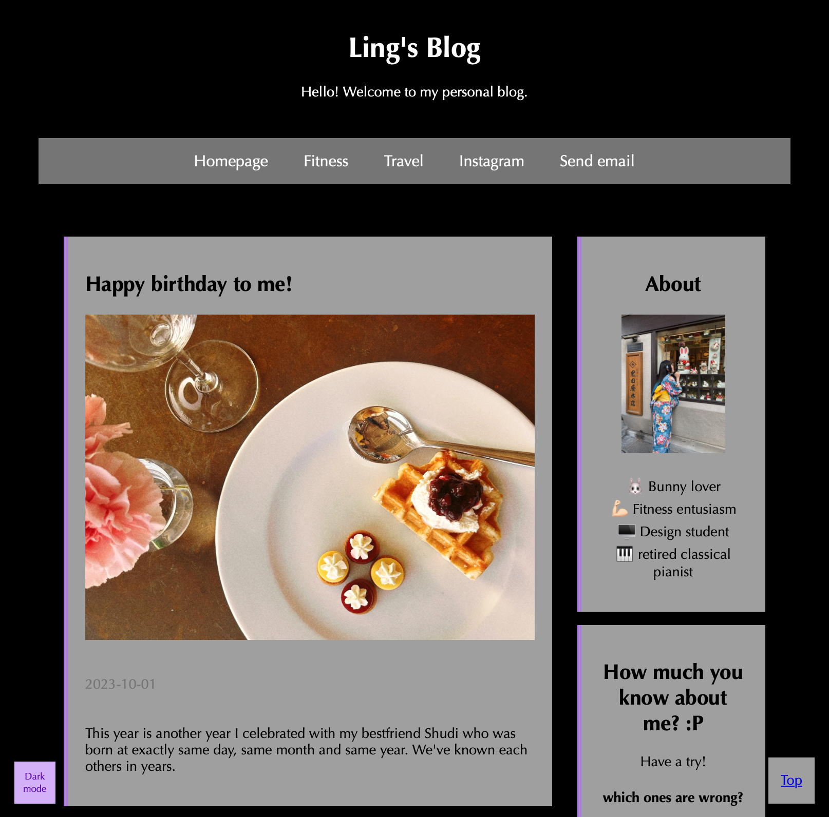
This project was my first foray into web design that involved coding a website from the ground up. The goal was to create a personal blog to share my interests and experiences in a visually appealing, digital format. I focused on building a clean, minimalist design, taking inspiration from sites like Apple and the Skye demo.
A key feature of this project is its responsiveness. Using Flexbox and Grid, I implemented layouts that adapt smoothly to various screen sizes, ensuring an optimal viewing experience across desktops, tablets, and mobile devices. This was achieved through CSS media queries and techniques like auto-fit and minmax for the grid.
Developing this blog allowed me to learn HTML, CSS, and responsive design principles. It was a challenging but rewarding experience that solidified my passion for web development.